


Summary of Why This Funnel Works:
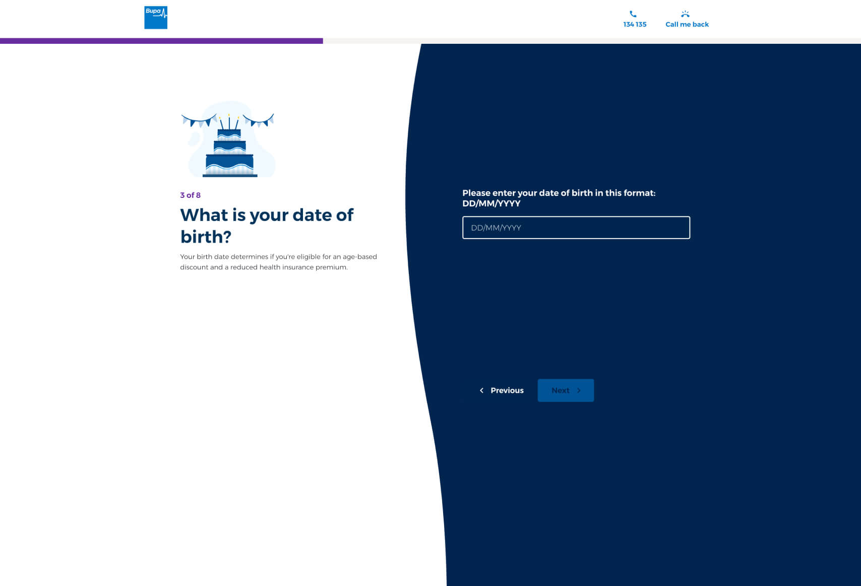
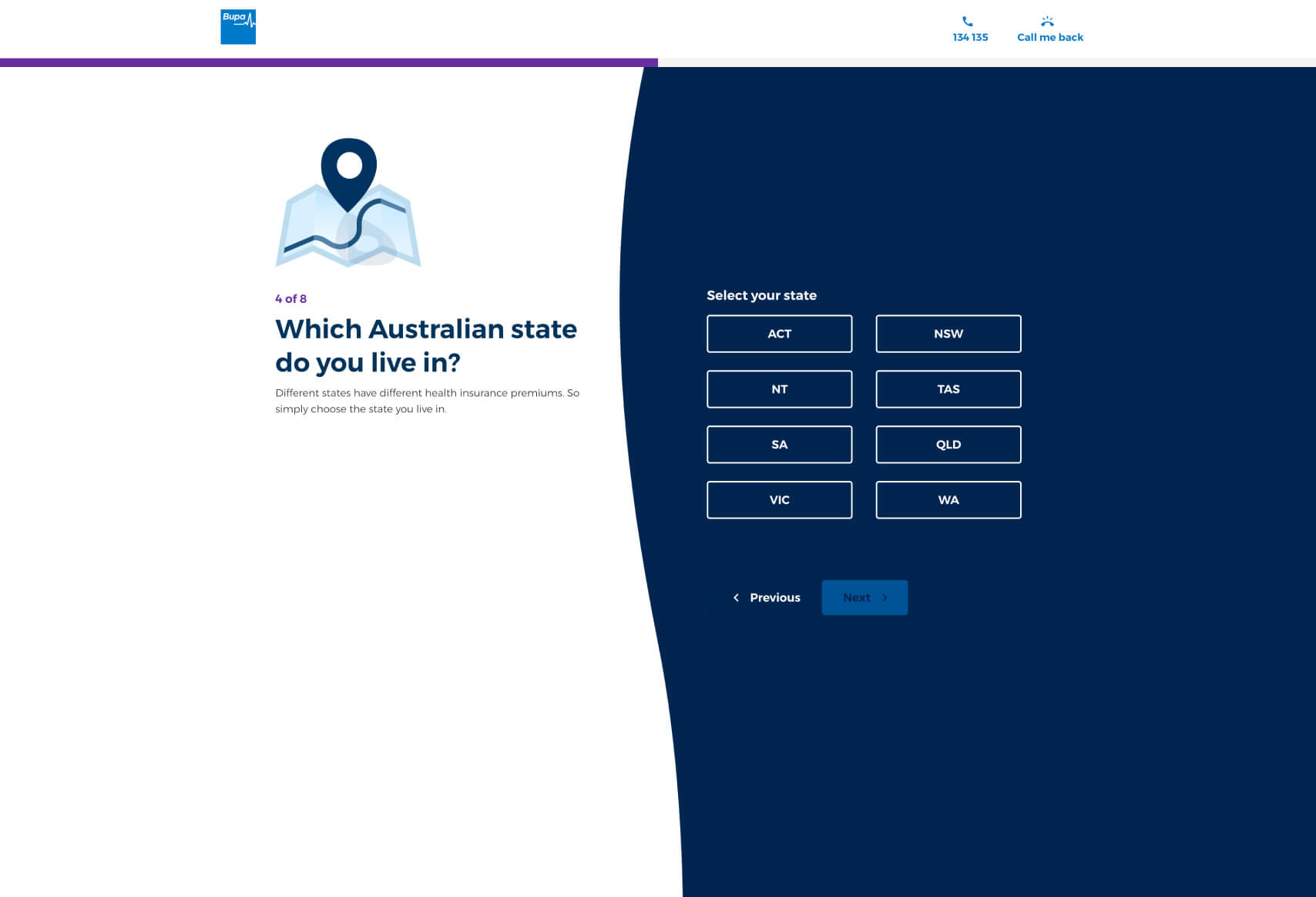
- Guided, Step-by-Step Process: The funnel carefully guides users through eight distinct steps, each focusing on a specific aspect of the user’s health insurance needs. This gradual approach reduces overwhelm and allows users to concentrate on one decision at a time.
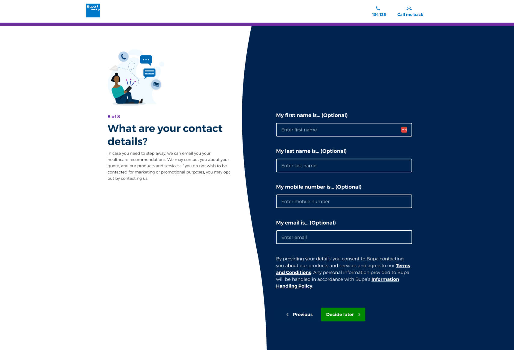
- Personalization Throughout: From the first question about residency status to the final contact details, each step is designed to personalize the experience, ensuring that the user feels the process is tailored specifically to them.
- Simple and Consistent Design: The clean, consistent design with a blue and white color scheme helps maintain focus and ensures the user experience is smooth and distraction-free.
- Engagement with Minimal Input Required: Each step typically requires only one choice or input from the user, which makes the process feel manageable and quick, reducing the likelihood of abandonment.
- Transparency in Pricing: The final stage provides clear, detailed pricing options that align with the user’s previously given information, building trust and making the decision-making process more straightforward.
Possible Reasons Why Bupa Has Chosen This Design/Funnel:
Bupa may have opted for this detailed, step-by-step funnel design to create a more personalized and less intimidating experience for users. Health insurance can be a complex product, and by breaking down the process into smaller, manageable steps, Bupa likely aims to reduce decision fatigue and make the user feel more confident in their choices.
This approach also allows Bupa to gather important information incrementally, which likely helps in tailoring the insurance options displayed at the end. By personalizing the recommendations based on inputs such as residency status, income, and the type of coverage needed, Bupa can offer more relevant and appealing options to potential customers.
The design’s simplicity and clarity might be intended to minimize distractions and keep users focused on the task at hand, improving the overall user experience. The consistent visual theme and straightforward language are likely chosen to make the process as intuitive as possible, thereby increasing the chances of users completing the funnel and making a purchase.
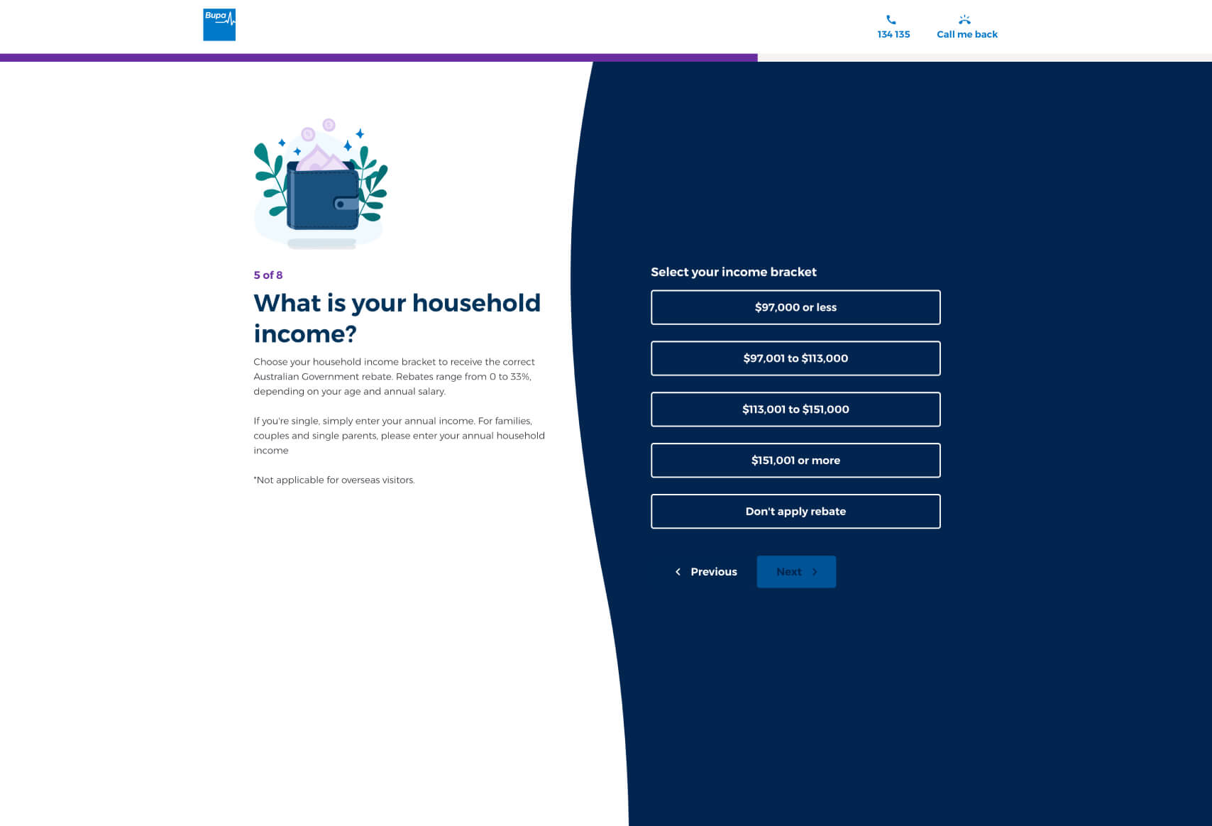
Impactful Questions from the Bupa Funnel:
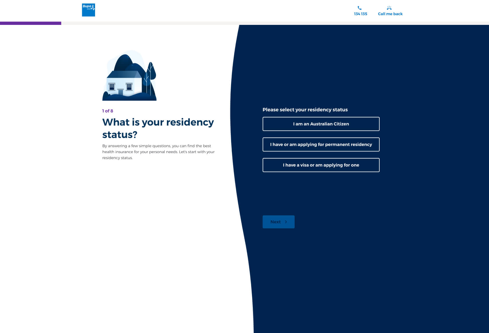
- “What is your residency status?”
- Foundation for Personalization: This question sets the stage for the entire experience, ensuring that the options presented later are relevant to the user’s legal status, which can significantly affect eligibility and pricing.
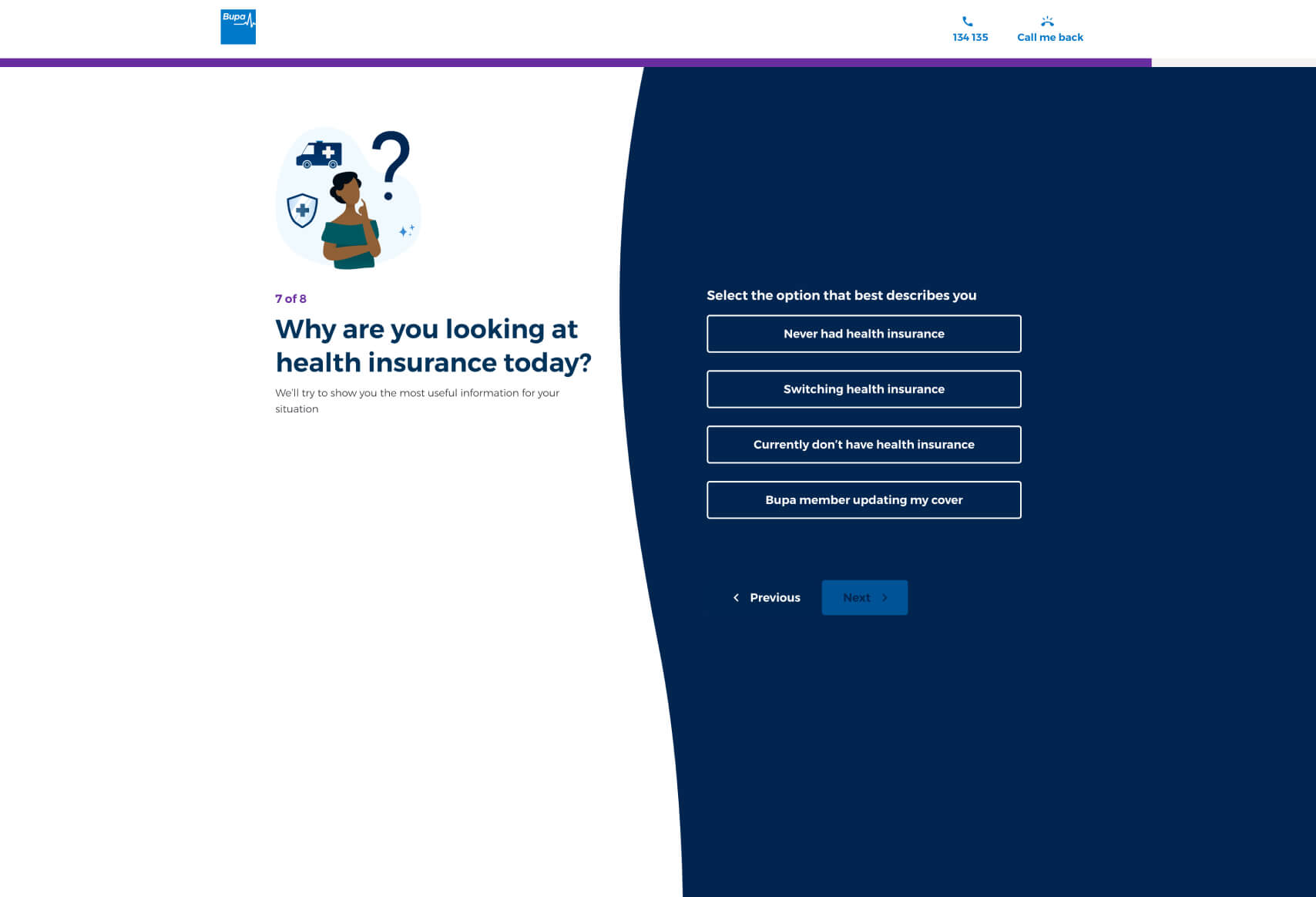
- “Why are you looking at health insurance today?”
- Contextual Understanding: By understanding the user’s motivation, Bupa can tailor the information and options presented, making the process feel more relevant and supportive of the user’s current needs.
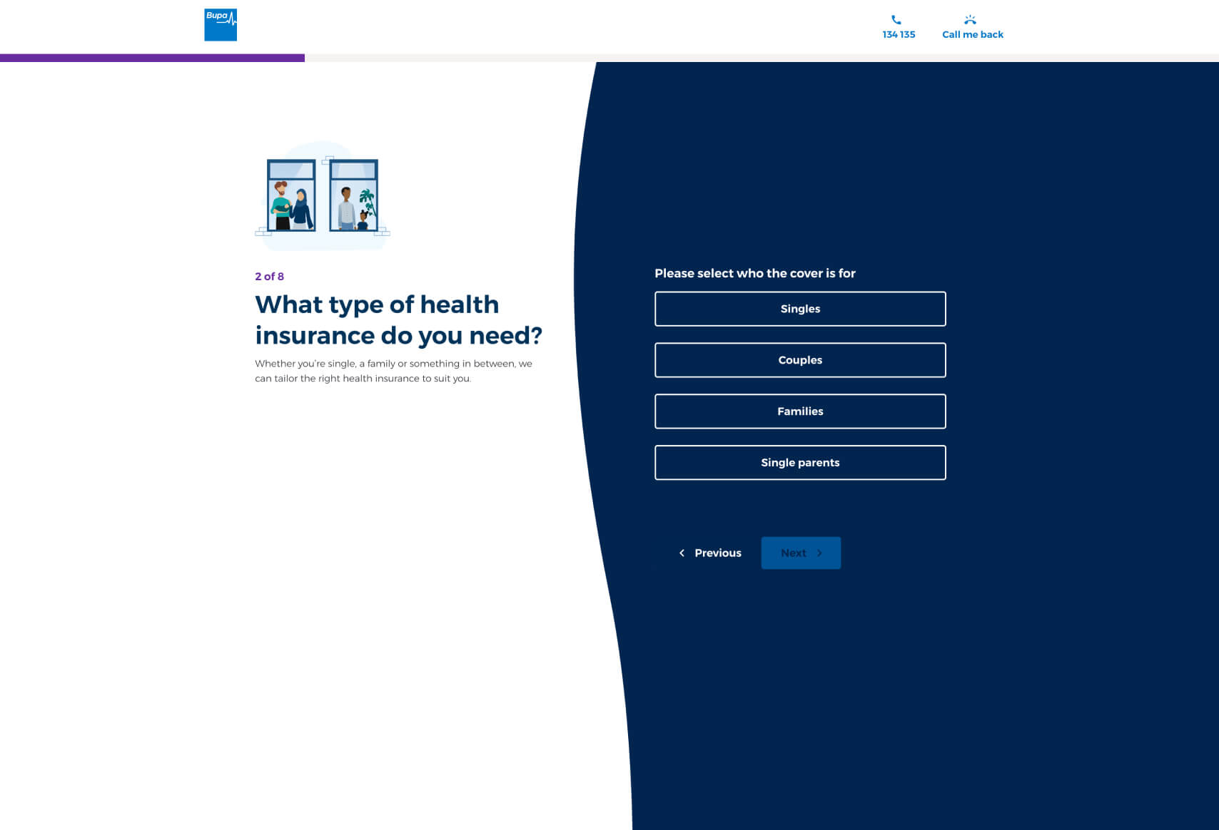
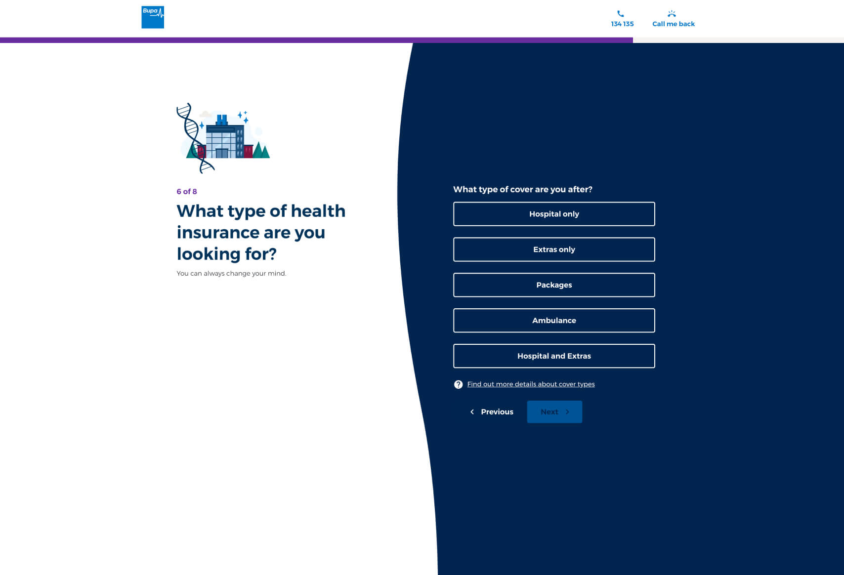
- “What type of health insurance are you looking for?”
- Focused Recommendations: This question allows Bupa to narrow down the available plans to those that best meet the user’s specific requirements, streamlining the decision-making process and increasing the likelihood of conversion.
This funnel design effectively balances user-friendly interaction with data collection, likely leading to improved customer engagement and higher conversion rates. For more examples of effective funnel designs, you can explore our listings on Convincely’s website.
 No development or design required
  Executed by just adding one line of Convincely code to your website
  Plan and strategize with your team. Execute and deploy with Convincely