


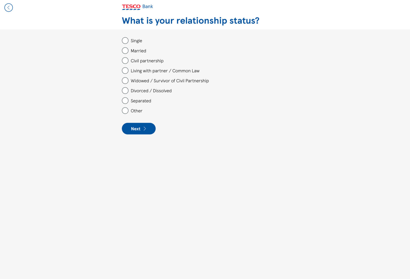
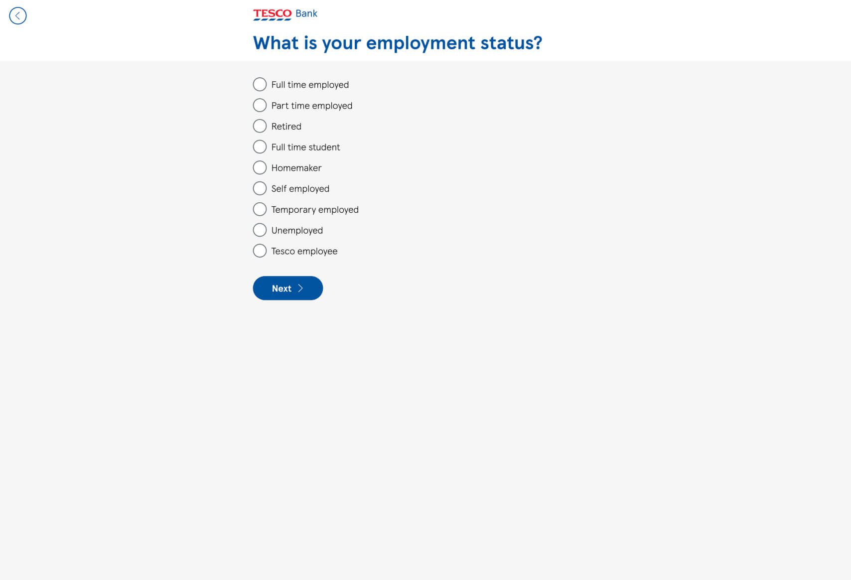
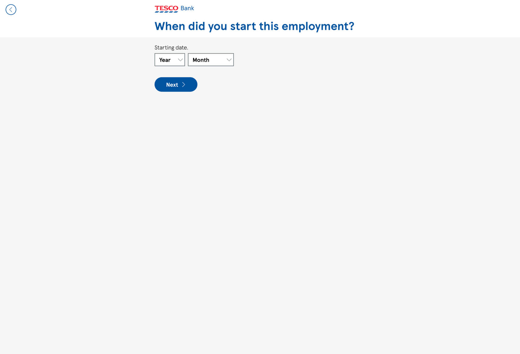
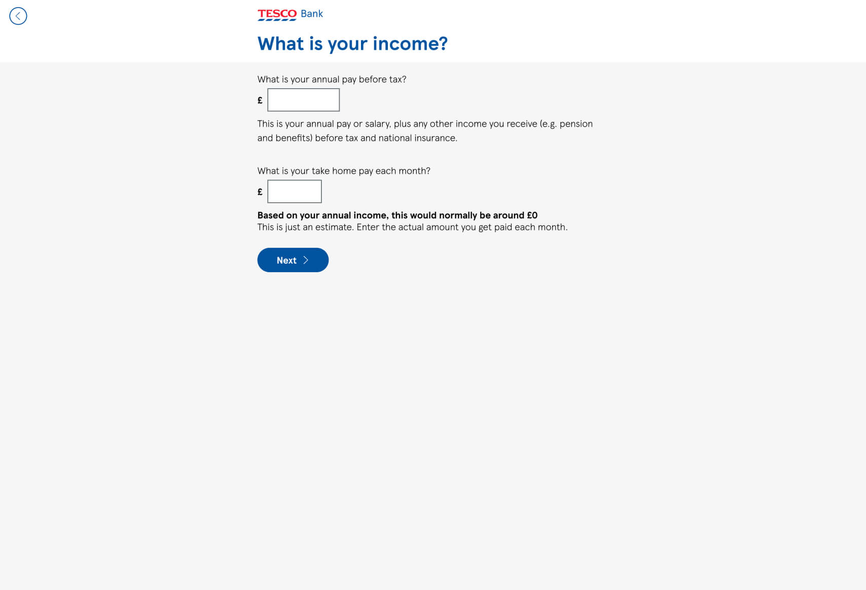
Funnel Analysis for Tesco Bank Credit Card Eligibility
Key Strengths of the Funnel:
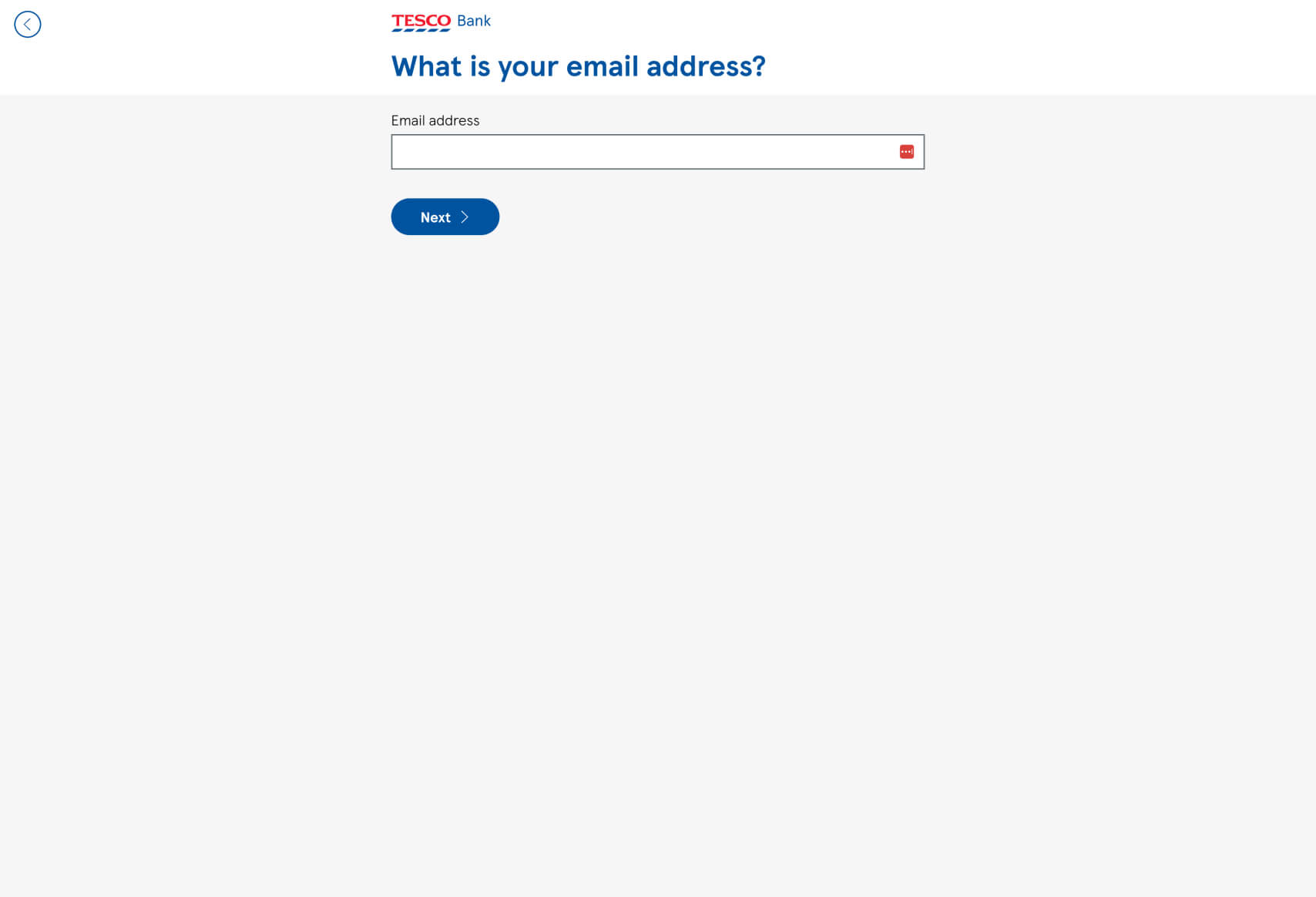
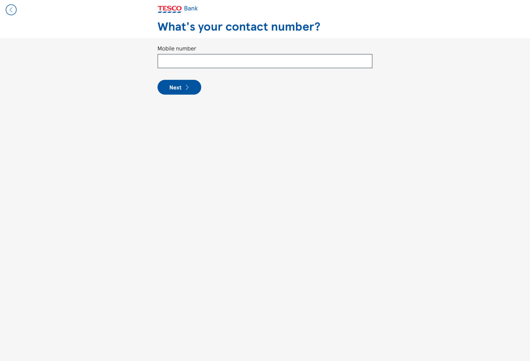
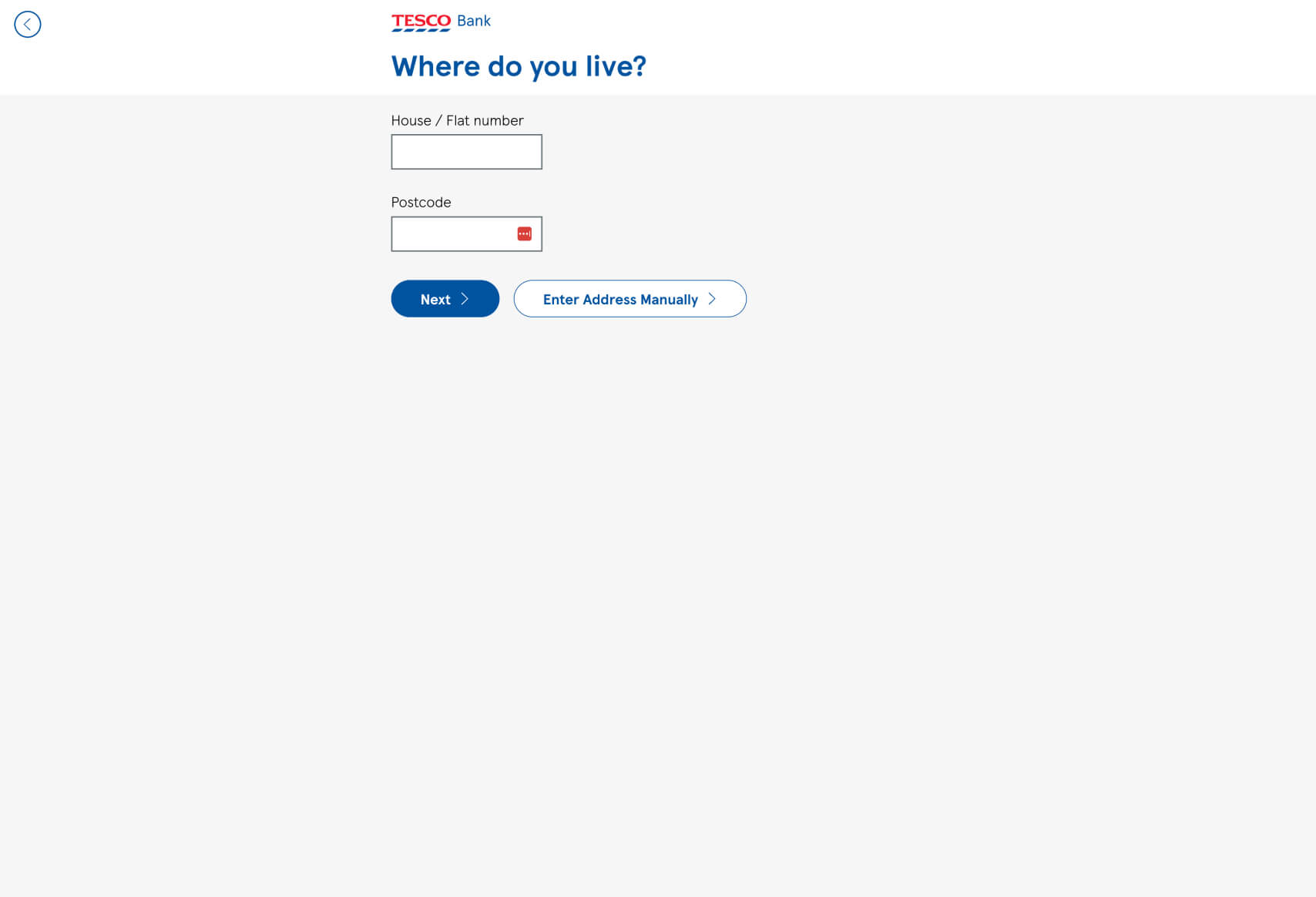
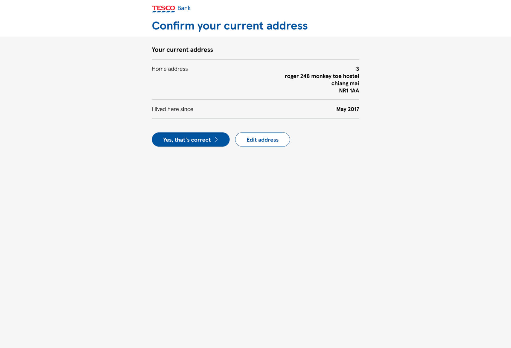
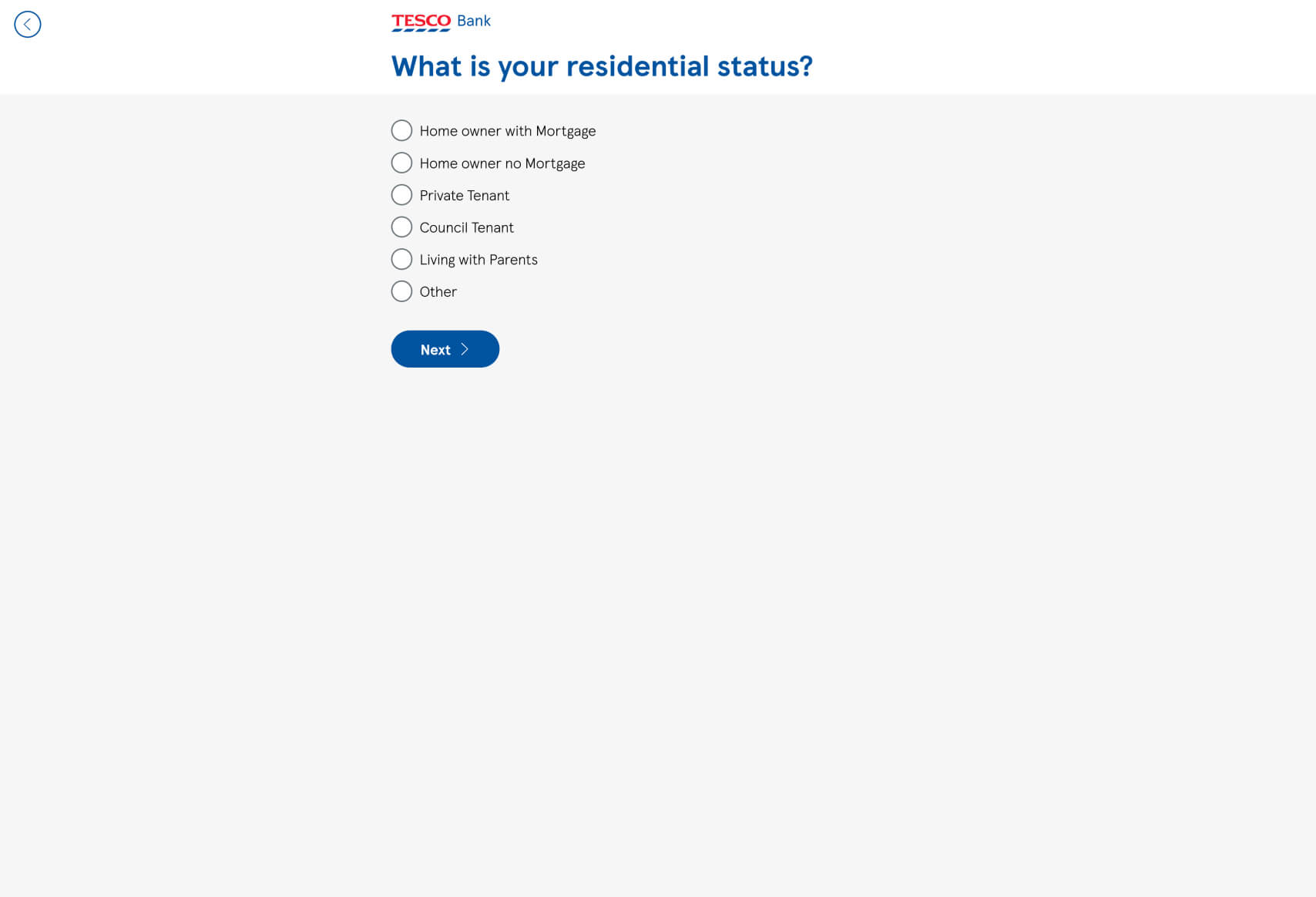
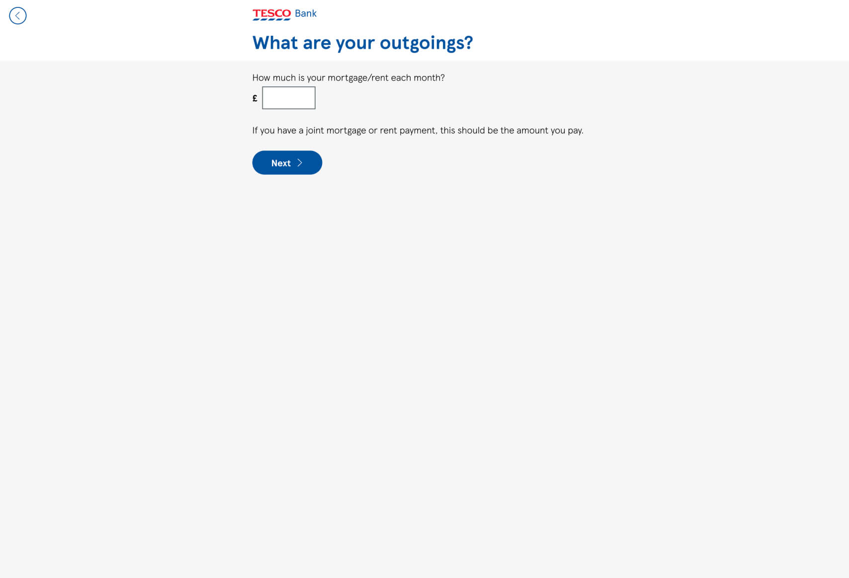
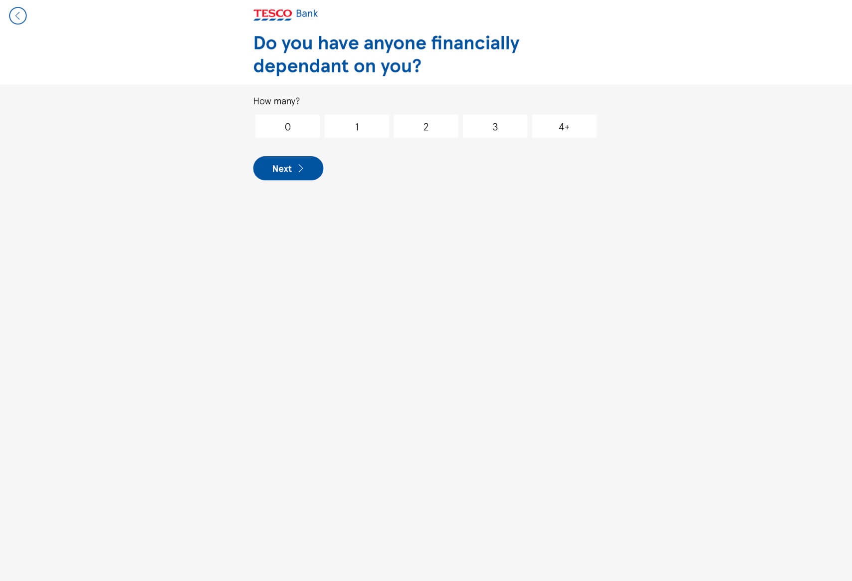
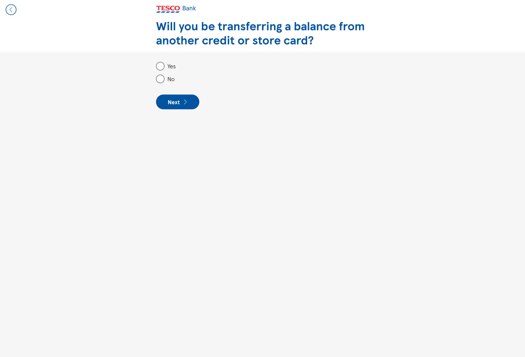
- Clear Progression: The funnel is designed to guide the user through each step of the eligibility check with simple and direct questions. The use of a progress-oriented approach reduces cognitive load and keeps users engaged.
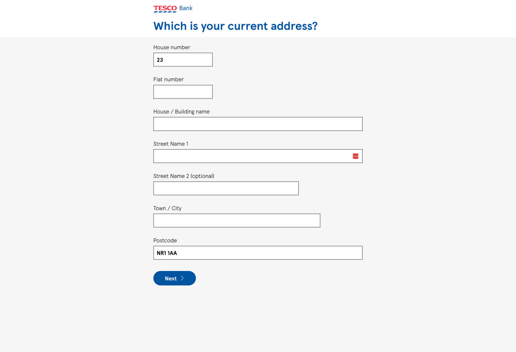
- Minimalistic Design: The clean and uncluttered design keeps the user focused on the task at hand, reducing the likelihood of distraction. The large amounts of white space help to avoid overwhelming the user with too much information at once.
- Consistency in Branding: The consistent use of Tesco Bank’s branding, including colors and typography, helps maintain user trust and recognition throughout the funnel.
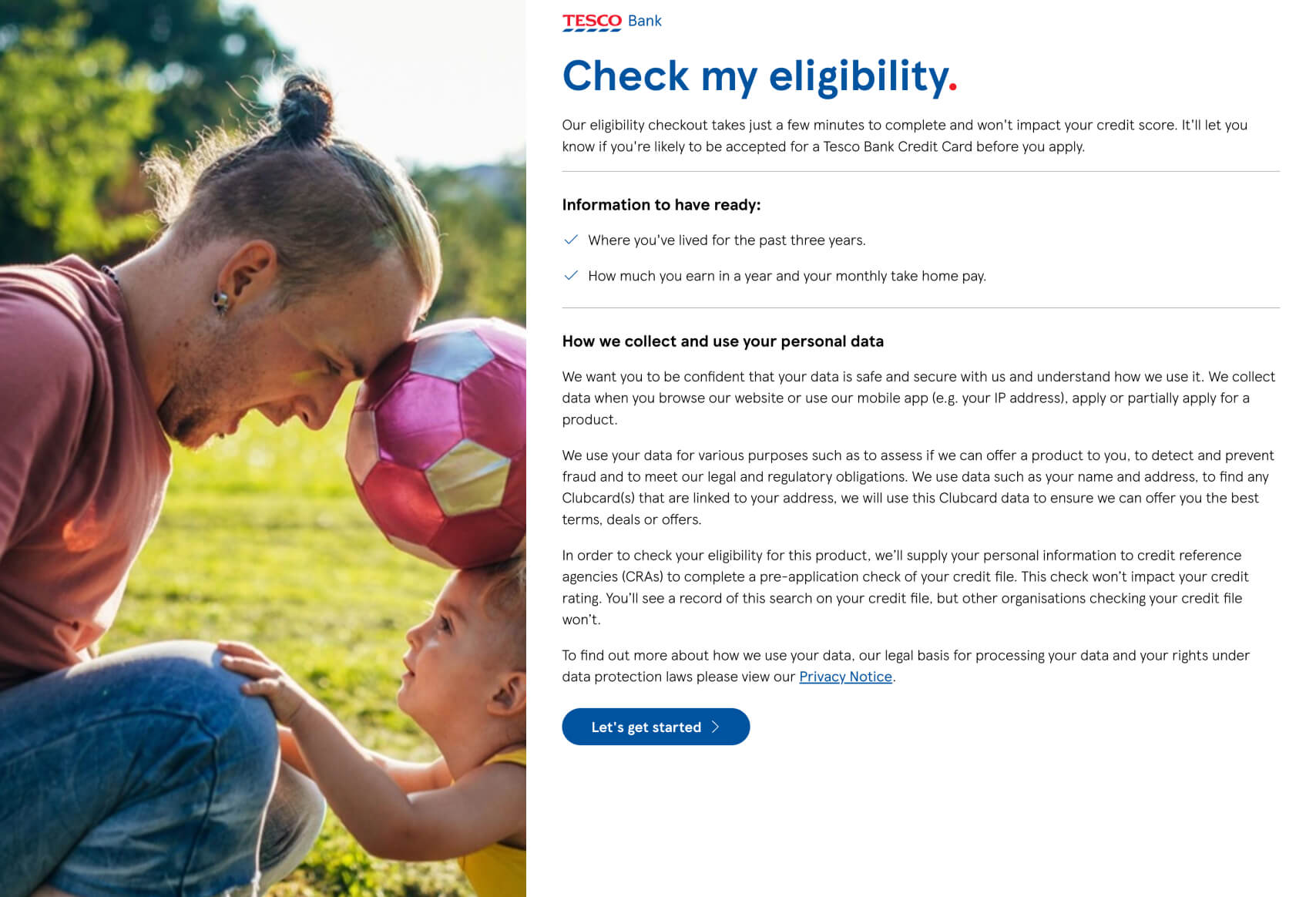
- Human Touch: The initial image featuring a father and child adds a relatable, human element that can make users feel more at ease, creating an emotional connection before entering personal details.
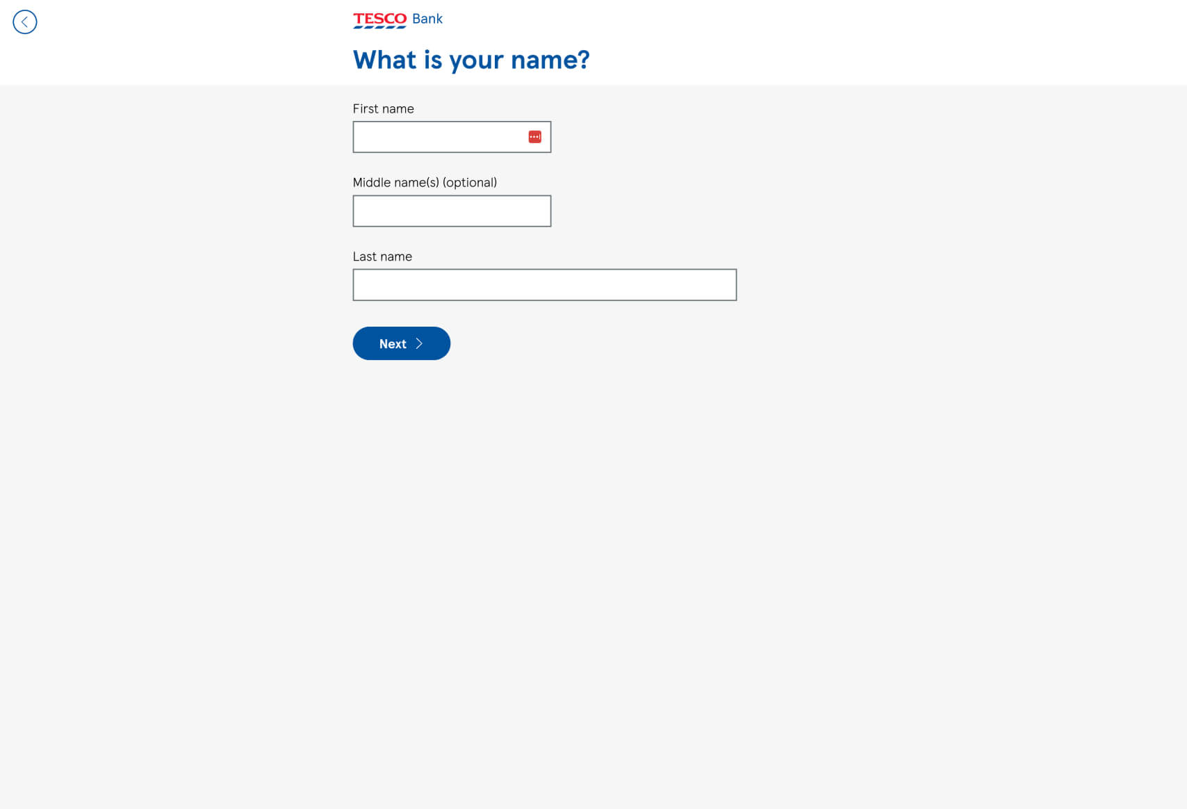
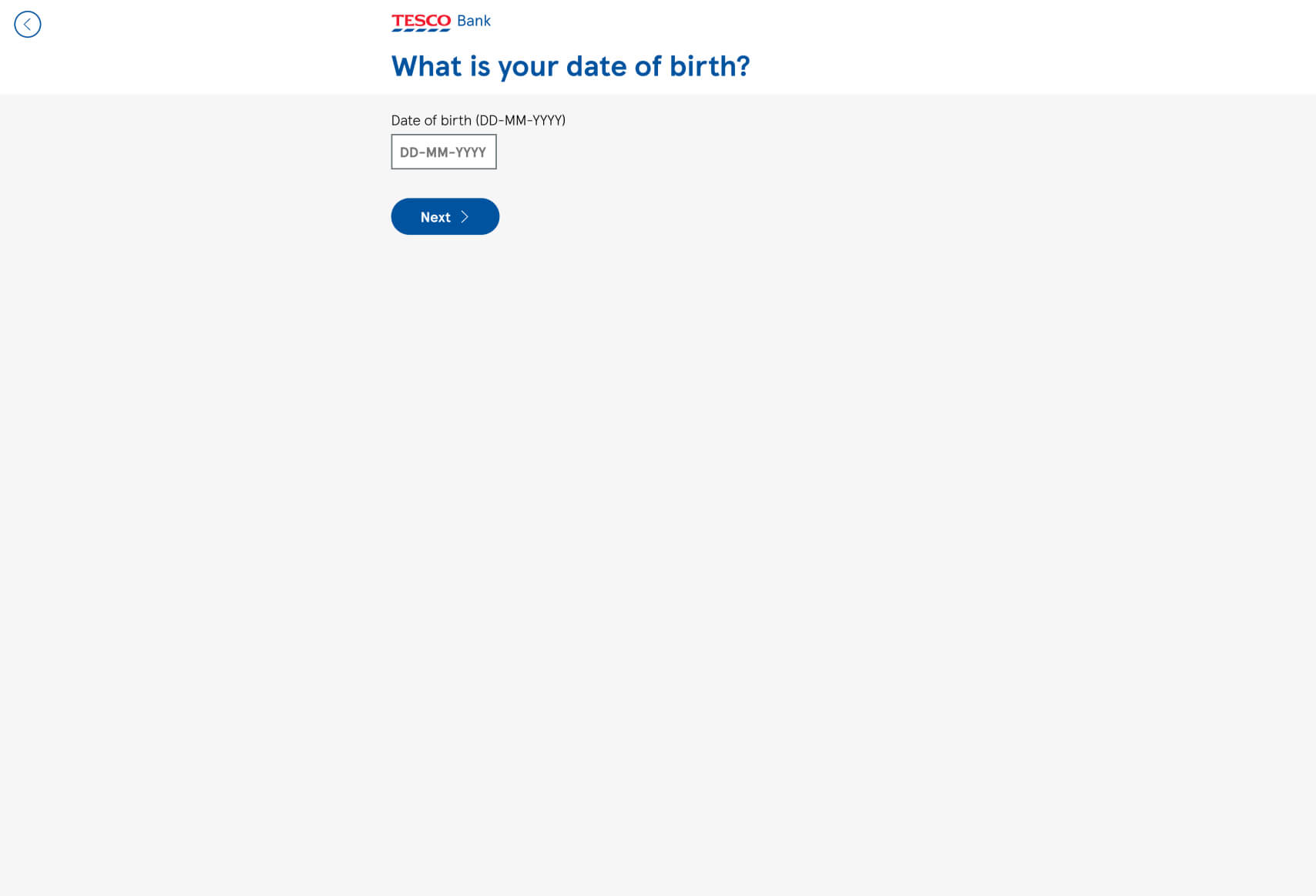
- Guided Data Entry: The funnel smartly breaks down the information entry process into bite-sized chunks, making the experience less daunting and more user-friendly.
- Simple, Understandable Language: The language used is clear and direct, ensuring users understand exactly what is being asked of them at each stage.
Business Rationale and Benefits:
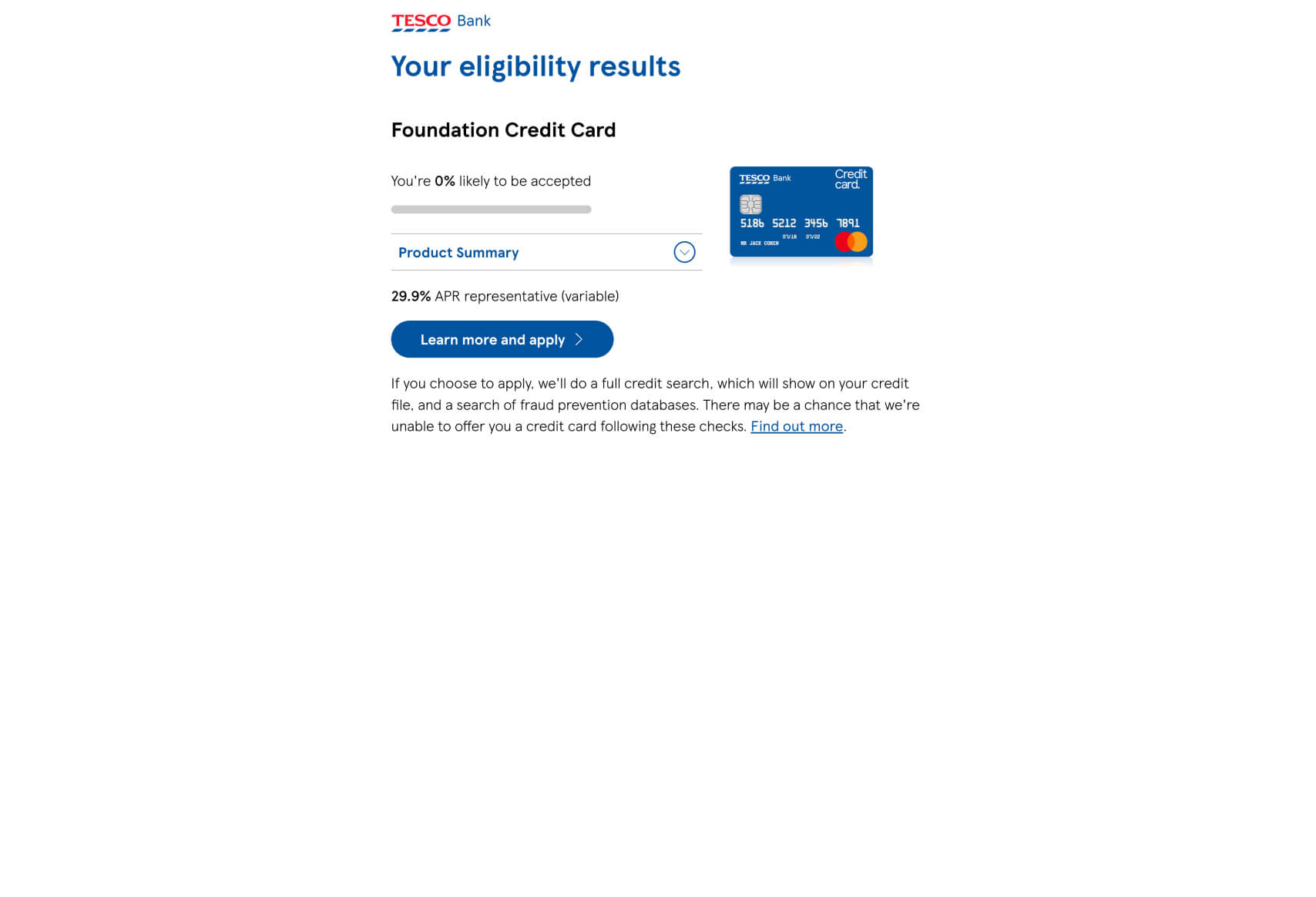
This funnel design for Tesco Bank is likely chosen over a traditional form because it simplifies a potentially complex process—checking credit card eligibility—into manageable steps. By doing so, Tesco Bank reduces user drop-off rates that are common in longer, more complex forms. The simplicity and directness of each step ensure that users do not feel overwhelmed, which can be a significant barrier to completion.
Additionally, by asking for information in a sequential and structured way, Tesco Bank can more effectively guide users through the eligibility process, ensuring that they provide all necessary details in a way that is easy to understand and complete. This reduces the chances of errors and incomplete submissions, which can lead to frustration and abandonment.
Finally, the user-friendly approach reflects positively on the brand, positioning Tesco Bank as a customer-centric institution that values its users’ time and effort, likely leading to higher conversion rates and customer satisfaction.
Impactful Questions and Why They Work:
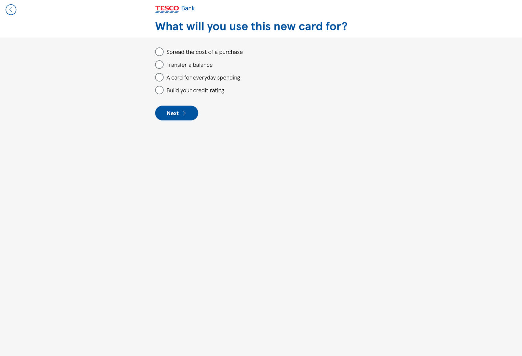
- “What will you use this new card for?”
- Purpose-Driven Engagement: This question helps Tesco Bank understand the user’s needs while also engaging them by making them think about how the product will fit into their lives. The options provided cater to different user intentions, ensuring relevance and personalization.
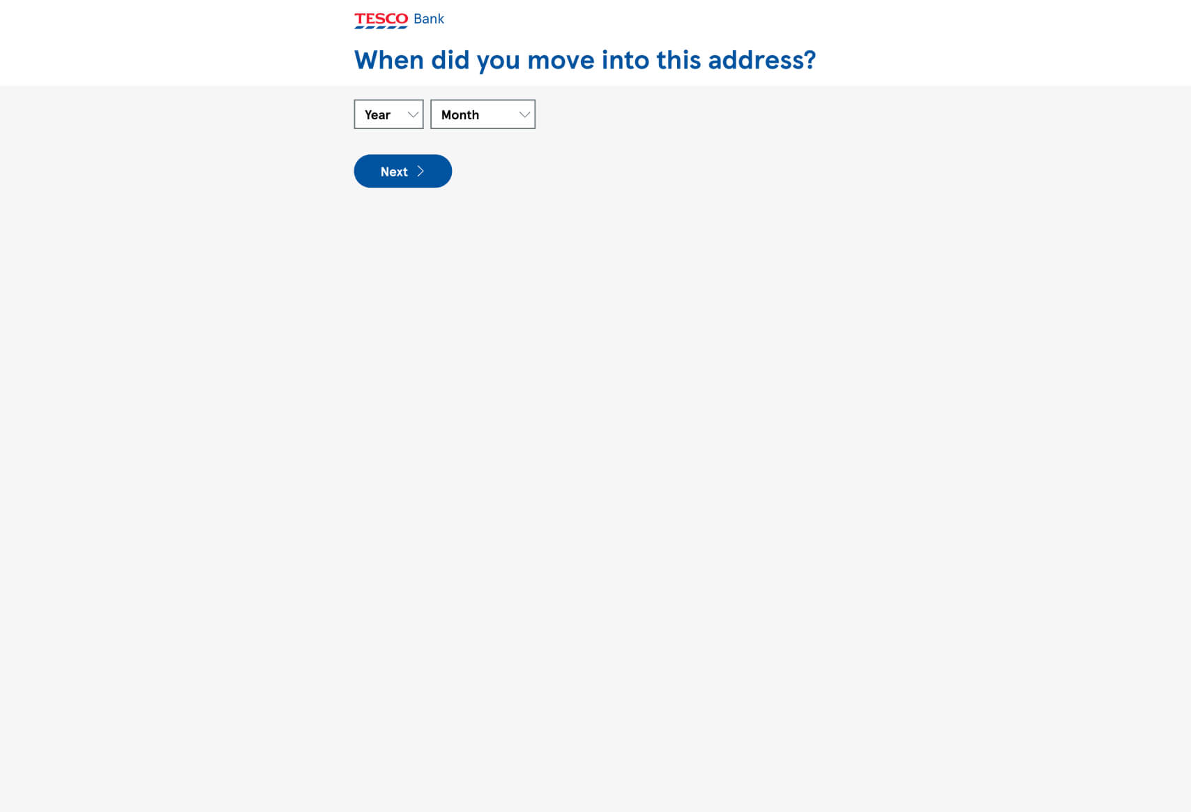
- “When did you move into this address?”
- Time-Based Validation: This question is crucial for credit scoring purposes but is phrased in a way that feels like a natural part of the process. It reassures users that their recent address history is important without making the request feel invasive.
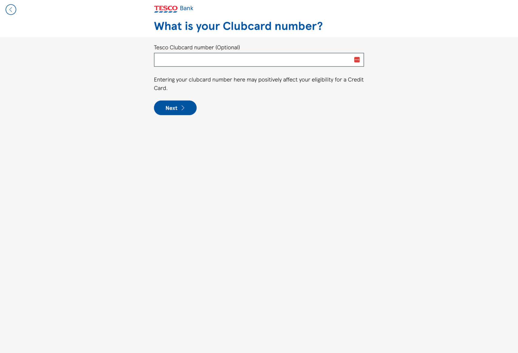
- “What is your Clubcard number?”
- Optional Value Addition: This question adds an optional layer of personalization and potential benefits, enhancing the user’s sense of control. The funnel smartly includes this as an optional field, making it feel like a bonus rather than an obligation.
This funnel by Tesco Bank exemplifies the best practices in guided user experiences, focusing on clarity, user ease, and emotional engagement to optimize the completion rate of their eligibility check process. The design enhances the overall user experience and likely leads to improved customer engagement. For further inspiration and comparison, you can explore other examples of high-converting funnels at Convincely’s listings.
 No development or design required
  Executed by just adding one line of Convincely code to your website
  Plan and strategize with your team. Execute and deploy with Convincely