


Quick Summary of Why This Funnel Works
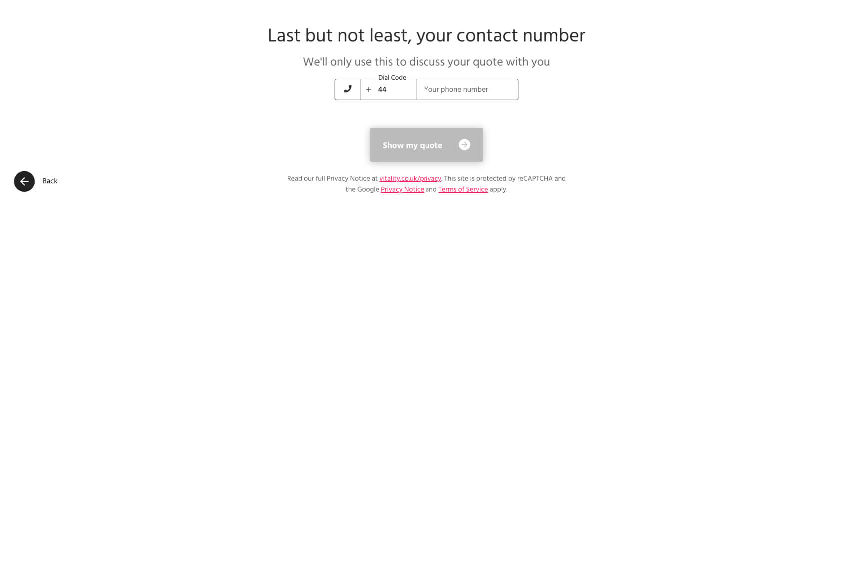
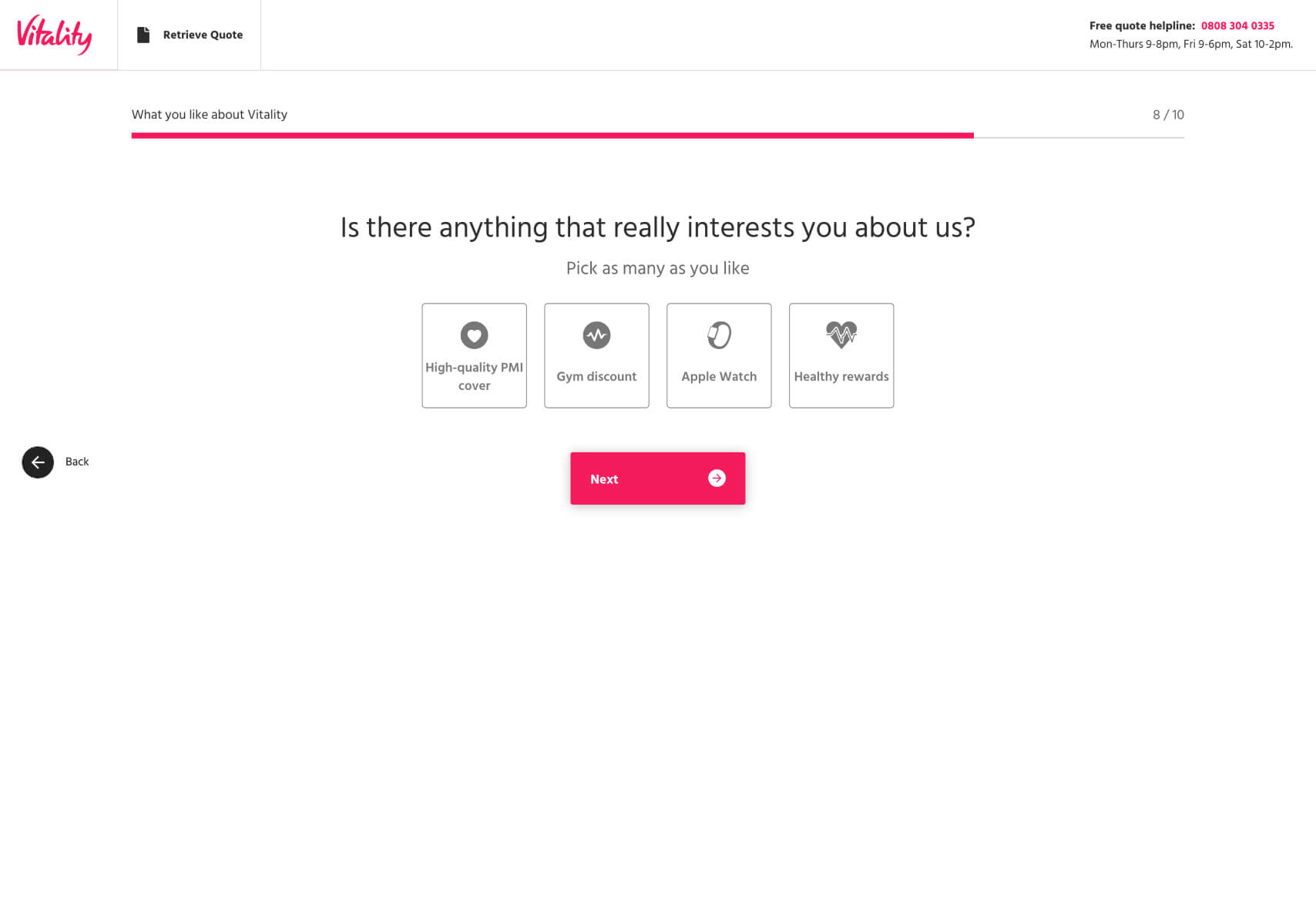
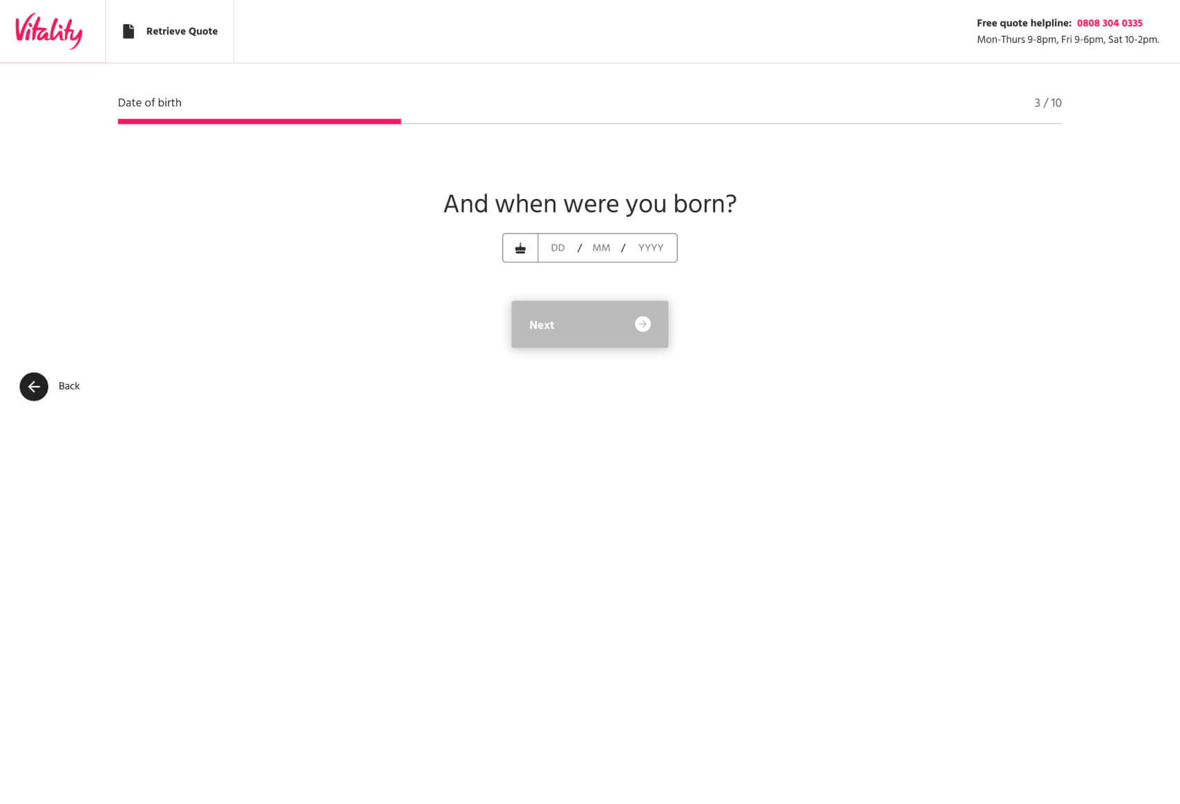
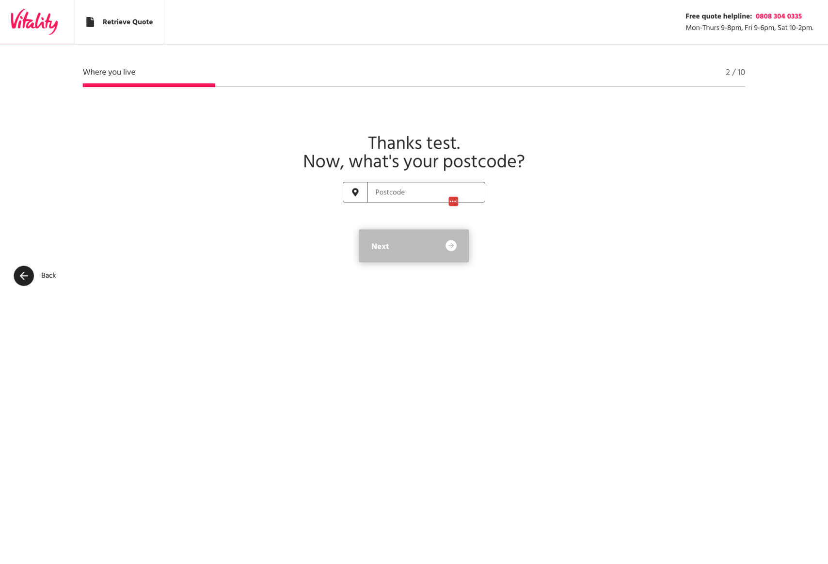
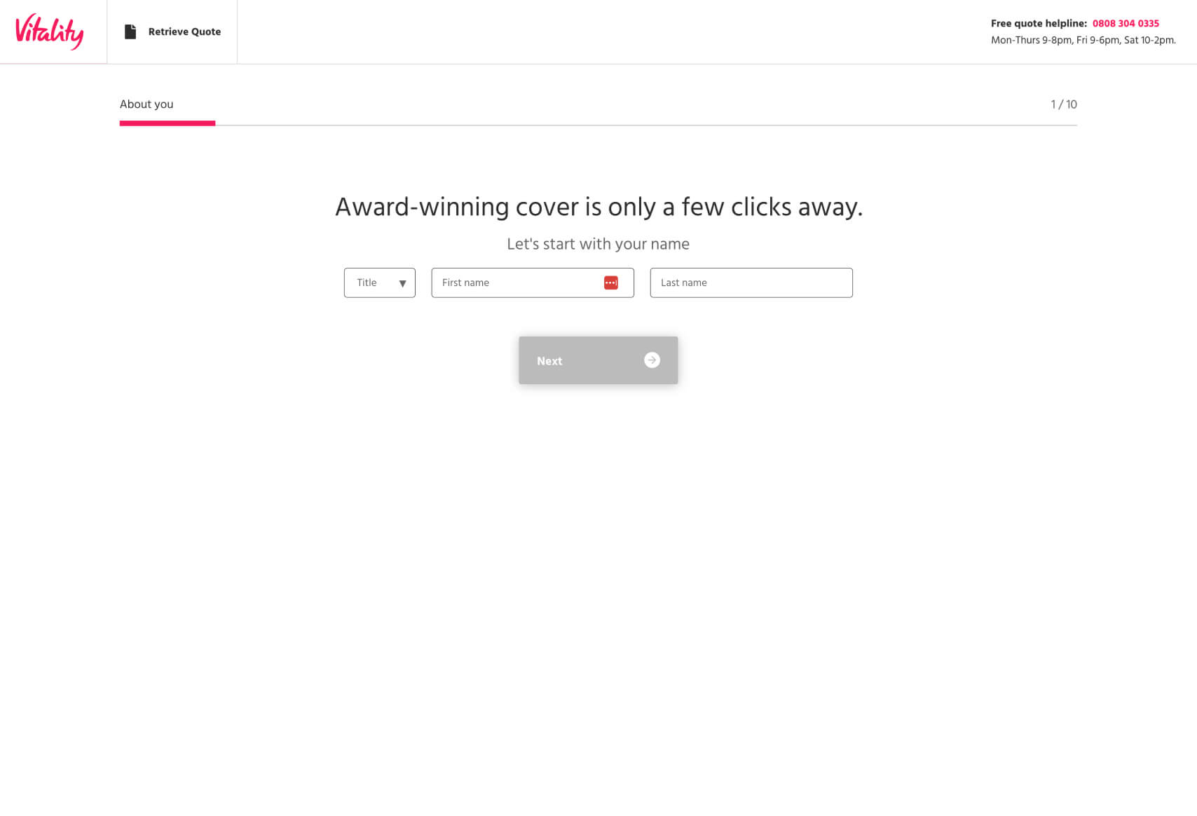
- Clear Progression: The funnel has a visible progress bar at the top, ensuring users always know how far they’ve come and how much is left. This transparency is key in keeping users engaged and reducing abandonment rates.
- Minimalistic and Clean Design: The design across all screens is clean, with significant white space and minimal distractions. This ensures the user focuses on the task, which is filling out the required information to receive a quote.
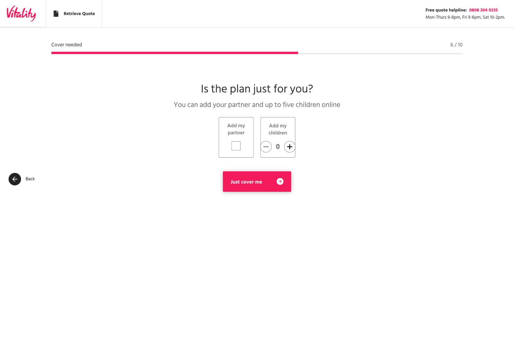
- Logical Sequence of Questions: The questions are ordered logically, starting with basic personal information and gradually moving to more specific details relevant to the insurance product. This reduces the cognitive load on users.
- Contextual Help and Reassurance: Each step provides clear, concise explanations, reassuring users why the information is needed. This builds trust and reduces any hesitation to proceed.
- Simple Interaction Elements: The use of large buttons, straightforward input fields, and easy-to-understand icons enhances usability, especially on mobile devices.
- Personalization and Relevance: Questions like “Is there anything that really interests you about us?” personalize the user experience, making the final quote seem more tailored to the user’s needs.
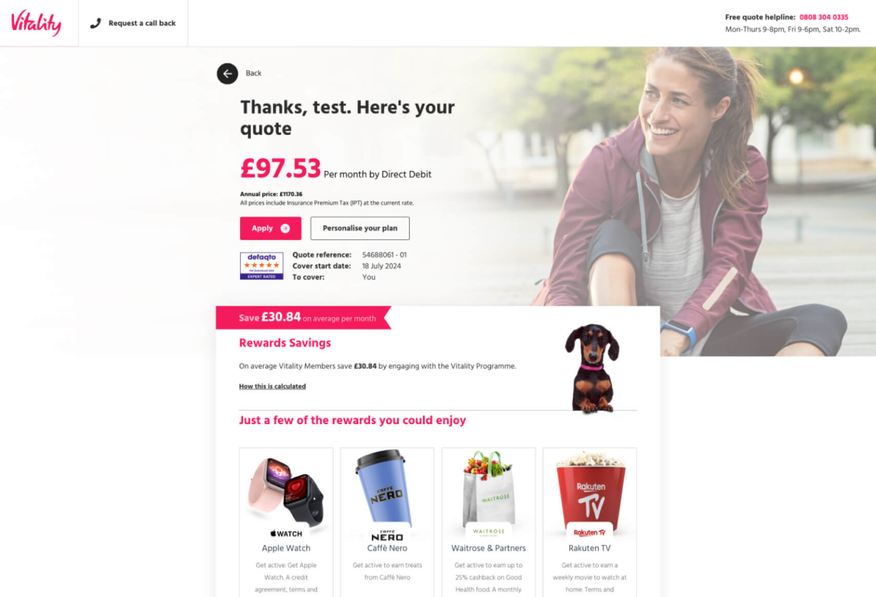
- Compelling Final Quote Screen: The final screen provides a clear and attractive quote, with a breakdown of potential savings through the Vitality program. The use of visual elements, such as the Apple Watch and rewards, adds value and makes the offer more appealing.
Why This Business Might Choose This Funnel Design
This funnel, used by Vitality, is designed for Lead Generation in the insurance industry. The final screenshot confirms that the process culminates in a personalized insurance quote with a strong call to action (CTA) to either “Apply” or “Personalize your plan.”
Here’s why Vitality might have chosen this design over a more traditional form:
- Enhanced User Engagement: The step-by-step design encourages users to complete the process by breaking down the information into manageable pieces. This makes the process less overwhelming compared to a traditional, single-page form with many fields.
- Improved Conversion Rates: The guided experience reduces friction and keeps users moving forward. The progress bar, clear CTAs, and logical flow all contribute to higher completion rates, ultimately leading to more leads.
- Trust and Transparency: By providing contextual explanations at each step, Vitality builds trust with the user. This is crucial in the insurance industry, where users are often hesitant to share personal information.
- Data Quality and Personalization: The funnel collects information in a way that feels personalized to the user, ensuring that the final quote is highly relevant. The personalized final screen, which shows potential rewards and savings, further enhances this effect, making the offer more compelling.
- Visual Appeal and Added Value: The final screen not only presents the quote but also highlights the additional benefits of the Vitality program, such as savings and rewards. This adds value to the offer and differentiates Vitality from competitors.
Key Impactful Questions in the Funnel
1. “Is there anything that really interests you about us?” (Screen 3)
- Personalization and Relevance: This question stands out because it allows users to feel that their specific interests are being considered, enhancing the personalization of the quote. The multiple-choice format also makes it easy for users to quickly select what matters most to them.
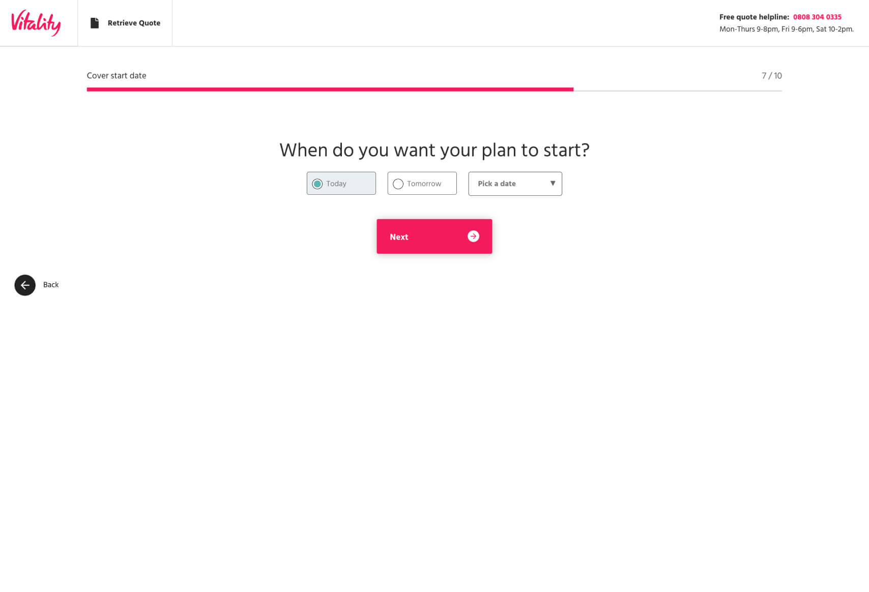
2. “When do you want your plan to start?” (Screen 4)
- Urgency and Commitment: Asking users to choose a start date introduces a sense of urgency and commitment, making them more likely to complete the funnel and take action on the quote.
3. “Thanks, test. Here’s your quote” (Final Screen)
- Personalized Confirmation: Using the user’s name in the final quote screen creates a personalized touch that makes the user feel recognized and valued. This, combined with a clear breakdown of the cost and potential savings, makes the offer more compelling and actionable.
This funnel is a great example of how a well-structured and thoughtfully designed experience can significantly enhance lead generation efforts. The user journey is carefully crafted to reduce friction, build trust, and ultimately drive conversions by making the process as seamless and engaging as possible. This approach likely leads to improved user experience and higher customer engagement.
For more examples of effective funnel designs, you can explore other sites we’ve analyzed at Convincely Listings.
 No development or design required
  Executed by just adding one line of Convincely code to your website
  Plan and strategize with your team. Execute and deploy with Convincely