Heat Mapping
Heat mapping is a visual representation of user behavior on your website, showing where visitors click, move their cursor, and scroll. It’s like having a thermal camera for your website, revealing hot spots of user engagement and cold areas that are often overlooked.
How it works:
Heat mapping typically involves:
- Collecting data on user interactions with your website
- Aggregating this data into visual overlays on your web pages
- Using color gradients to represent the intensity of user activity (e.g., red for high activity, blue for low)
- Analyzing these visualizations to gain insights into user behavior
Common types of heat maps include:
- Click maps: Show where users click or tap on a page
- Move maps: Indicate where users move their cursor
- Scroll maps: Display how far down a page users typically scroll
Why you should use it:
Heat mapping provides valuable insights that can:
- Identify which elements of your page are attracting the most attention
- Reveal usability issues or confusing page elements
- Guide layout and design decisions
- Improve conversion rates by optimizing placement of key elements
- Validate or challenge assumptions about how users interact with your site
How to get started:
- Choose a heat mapping tool (there are many options available)
- Install the tracking code on your website
- Select key pages to analyze (e.g., homepage, product pages, landing pages)
- Collect data over a significant period or number of visitors
- Analyze the resulting heat maps
- Use insights to inform design changes and A/B tests
How it complements personalization:
At Convincely, we’ve taken heat mapping to the next level by integrating it with our real-time personalization approach. Instead of just generating static heat maps, we use dynamic, personalized heat mapping to inform and refine our user experiences in real-time.
Our system doesn’t just collect aggregate data – it analyzes individual user behavior as it happens. This allows us to create personalized “micro heat maps” for each user, which we use to dynamically adjust the layout and content of our funnels.
For example, if we notice a user is repeatedly hovering over a certain area without clicking, we might proactively offer more information or a clearer call-to-action in that spot. If a user is quickly scrolling past certain sections, we might condense or remove that content in future steps of their journey.
We also use heat mapping data to inform our question-asking strategy. By understanding which areas of a page users engage with most, we can design more effective questions and place them strategically within the user’s visual journey.
Moreover, we aggregate heat mapping data across similar user segments to continually refine our personalization algorithms. This allows us to start new user journeys with layouts and content placements that have proven effective for similar users in the past.
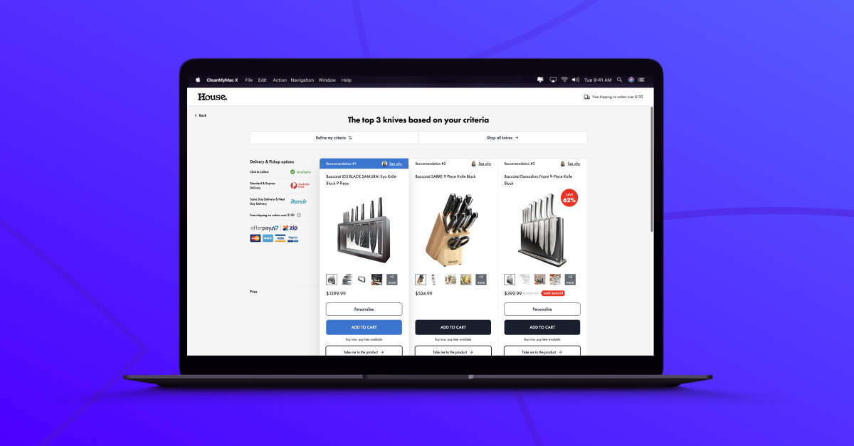
You can see innovative applications of heat mapping insights in our funnel database. Look for entries that showcase clever placement of key elements or unique layout designs that clearly respond to user behavior patterns.
Remember, the power of heat mapping isn’t just in seeing where users click – it’s in understanding why they interact with your site the way they do, and using that knowledge to create more intuitive, engaging experiences. By combining heat mapping with real-time personalization, you can create dynamic, responsive interfaces that adapt to each user’s unique behavior patterns, dramatically improving engagement and conversion rates.