Mobile Optimization
Mobile Optimization is the process of adjusting your website content and design to ensure an optimal experience for users on mobile devices. It involves creating a responsive design, improving page load speeds, and tailoring user interactions for touch screens and smaller displays to enhance usability and conversions on smartphones and tablets.
How Mobile Optimization works:
Mobile Optimization typically involves implementing responsive web design, which automatically adjusts layout and content based on screen size. It also includes optimizing images and media for faster loading, simplifying navigation for touch interfaces, and prioritizing content for mobile viewing. Advanced mobile optimization might incorporate mobile-specific features like click-to-call buttons or location-based services.
Why you should prioritize Mobile Optimization:
As a business owner or marketer, Mobile Optimization is crucial in today’s mobile-first world. With an increasing number of users accessing the internet primarily through mobile devices, a mobile-optimized site ensures you’re not losing potential customers due to poor user experience. Mobile-friendly sites typically have lower bounce rates, higher engagement, and better conversion rates on mobile devices. Plus, mobile optimization is a key factor in search engine rankings, affecting your overall online visibility.
How to implement Mobile Optimization:
To optimize for mobile, start by implementing a responsive design that adapts to different screen sizes. Compress images and minify code to improve load times. Simplify navigation and make buttons easily tappable on touch screens. Use legible fonts and ensure sufficient contrast for readability on small screens. Test your site on various devices and use tools like Google’s Mobile-Friendly Test to identify areas for improvement.
How Mobile Optimization complements Convincely’s approach:
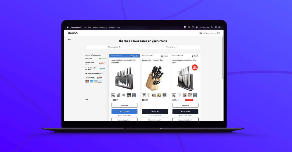
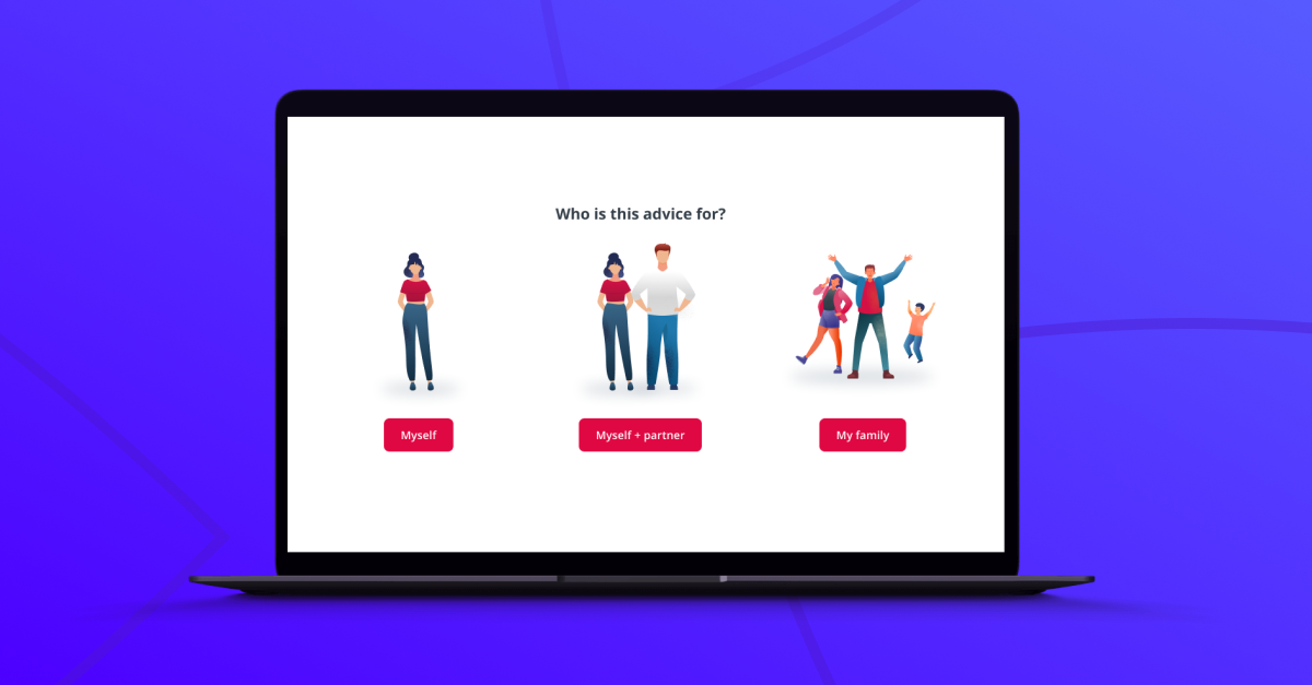
At Convincely, we see Mobile Optimization not just as a technical requirement, but as an opportunity for deeper personalization. While traditional approaches might focus on creating a single mobile-friendly version of a site, our full-page, visually-guided funnels adapt in real-time to each user’s specific device and usage patterns.
Our system doesn’t just resize content for smaller screens; it reimagines the entire user journey for mobile contexts. For instance, if we detect that a user is on a mobile device, we might prioritize different questions or content types that are more engaging on smaller screens. We could also adapt the interaction style, perhaps favoring swipe gestures over lengthy forms.
Unlike standard mobile optimization that might offer a simplified version of desktop content, our funnels create unique, mobile-native experiences. We’re not just making desktop content accessible on mobile; we’re crafting journeys that feel natural and intuitive on smartphones and tablets, taking advantage of mobile-specific capabilities like touch interactions or device orientation.
Moreover, our approach to Mobile Optimization isn’t just about adapting to screen size; it’s about understanding and responding to the mobile context. We use data about the user’s location, time of day, and even movement patterns to tailor the experience. For example, if we detect that a user is likely on-the-go, we might prioritize quick, easily digestible content and streamlined conversion paths.
What sets our approach apart is that we don’t see mobile as a limitation, but as a unique channel with its own opportunities for engagement. Every mobile-specific feature – from touch interactions to location awareness – becomes a tool for creating more relevant, engaging experiences. This creates a mobile journey that’s not just optimized, but truly tailored to each user’s device, preferences, and context.
You can explore real-world examples of how businesses are using advanced, mobile-optimized personalization in their funnels on our listings page. This resource showcases various approaches to creating adaptive, mobile-first user experiences across different industries.
Remember, while Mobile Optimization is essential for reaching mobile users effectively, it’s most powerful when integrated into a comprehensive, personalized user experience. At Convincely, we don’t just make your funnels mobile-friendly; we create dynamic, responsive experiences that adapt to each user’s unique device, preferences, and mobile context. Our goal is to transform Mobile Optimization from a technical necessity into a sophisticated tool for delivering highly relevant, engaging experiences that drive conversions and build lasting relationships with your mobile users.