


Summary of Reasons Why This Funnel Works:
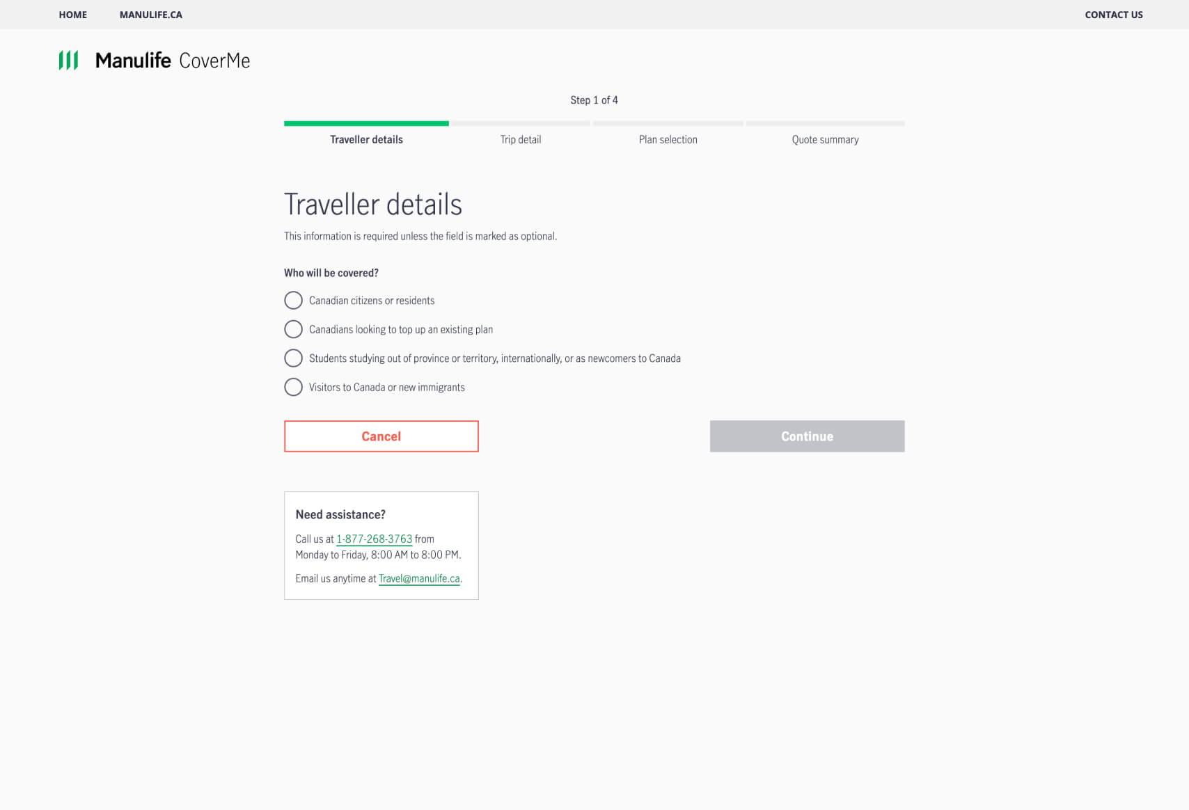
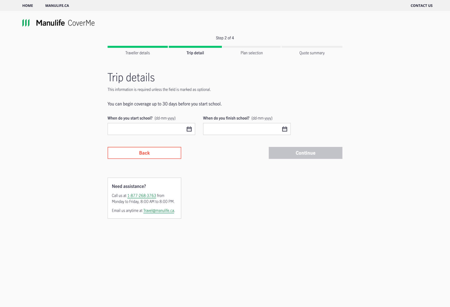
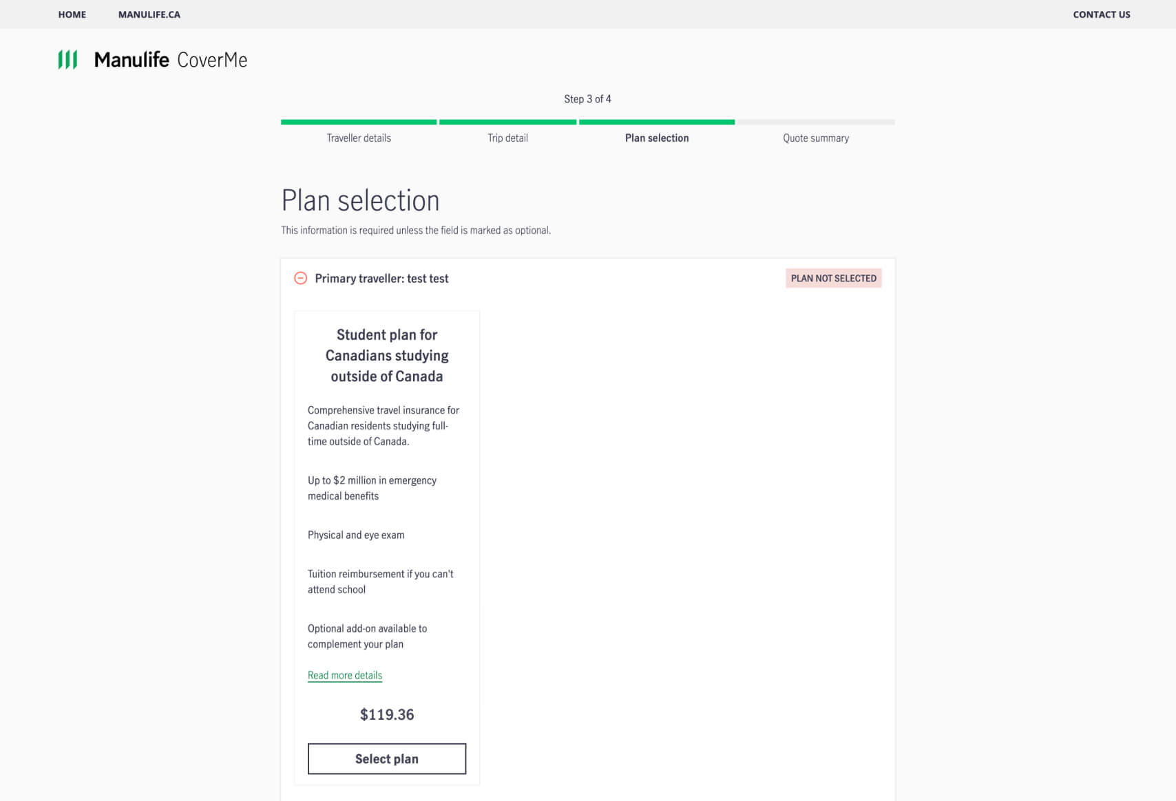
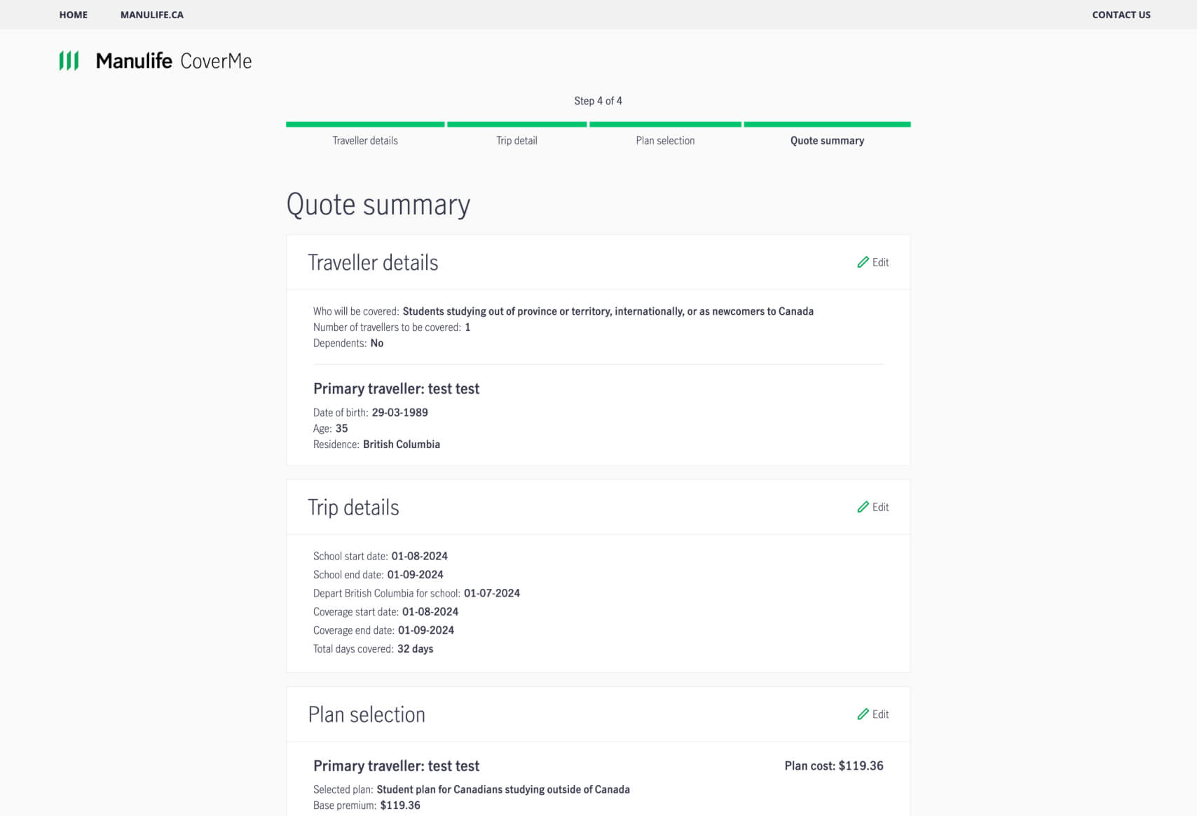
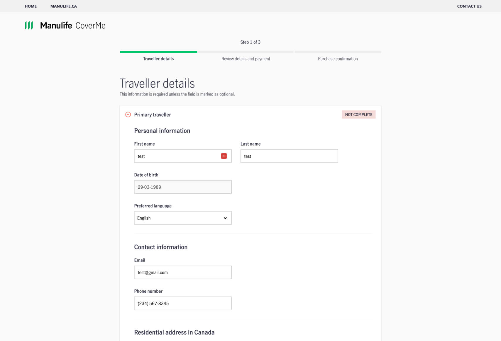
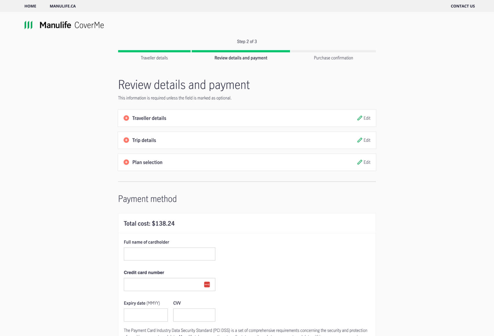
- Progress Tracking: The step-by-step progress bar clearly communicates to users where they are in the process, helping to reduce uncertainty and keep them engaged through to the final step.
- Modular Information Sections: The breakdown of information into distinct sections (e.g., “Traveller details,” “Trip details,” “Plan selection”) allows users to focus on one aspect at a time, making the form feel less overwhelming and more organized.
- Editable Summaries: The ability to review and edit specific sections (e.g., Traveller details, Trip details) before finalizing the purchase ensures that users can easily correct mistakes, increasing accuracy and user confidence.
- Clean and Professional Design: The minimalist design and clear typography align with the Manulife brand, conveying trustworthiness and professionalism, which is critical in a financial product funnel.
- Clear Cost Presentation: Displaying the total cost upfront in the payment section reassures users by providing transparency about the charges they will incur, reducing the potential for cart abandonment due to unexpected fees.
Why This Design/Funnel Was Chosen:
Manulife likely selected this funnel design to enhance user experience while collecting the necessary information to finalize an insurance purchase. Given that insurance can be a high-stakes decision involving personal and financial data, a clear and organized process is crucial. This design mitigates the complexity often associated with purchasing insurance by breaking down the process into manageable steps, which helps maintain user engagement and reduces the likelihood of errors or omissions.
The funnel’s modular design allows users to focus on one task at a time without feeling overwhelmed by the need to provide a large amount of information all at once. This also ensures that users can easily review and correct their inputs, which enhances the overall accuracy of the data collected. This approach is especially beneficial for Manulife as it not only improves the user experience but also ensures that the data they collect is comprehensive and accurate, reducing the need for follow-up and increasing the chances of a successful transaction on the first attempt.
By clearly displaying the cost of the insurance plan in the payment section, Manulife reinforces transparency, which can significantly reduce the chances of cart abandonment. This is particularly important in insurance sales, where unexpected costs can lead to user distrust and drop-offs. The design effectively balances the need for thorough data collection with the user’s need for a straightforward, stress-free experience, ultimately supporting higher conversion rates.
Most Impactful Elements in the Funnel:
- “Review details and payment” Step:
- Purpose: This step allows users to review and confirm all their details before making a payment, reducing the likelihood of errors and increasing user confidence.
- Impact: By enabling edits at this stage, Manulife reduces the friction associated with making corrections, ensuring users feel in control of their purchase.
- “Traveller details” Section:
- Purpose: Collects critical personal information needed for the insurance policy, ensuring that coverage is tailored to the user’s specific needs.
- Impact: The use of simple fields with clear labels makes this process straightforward, minimizing user frustration and improving data accuracy.
- “Total cost” Display in Payment Method:
- Purpose: Shows the user the exact amount they will be charged, providing transparency and helping to prevent any surprise fees.
- Impact: This clear presentation of costs builds trust and reduces the risk of users abandoning the funnel due to hidden charges.
This funnel design effectively balances user-friendly interaction with thorough data collection, likely leading to improved customer engagement and higher conversion rates. The personalization elements, such as tailored coverage based on user inputs, further enhance the user experience. For more examples of effective funnel designs, you can explore our database of websites that have successfully implemented similar strategies.
 No development or design required
  Executed by just adding one line of Convincely code to your website
  Plan and strategize with your team. Execute and deploy with Convincely